Components
Esta página aún no se encuentra traducida al español.
Introduction
Create form templates with the use of Components. Components are the building blocks of your customizable survey forms. They can be easily added or configured either from the Form settings panel or through the Edit button found on the header of the survey.
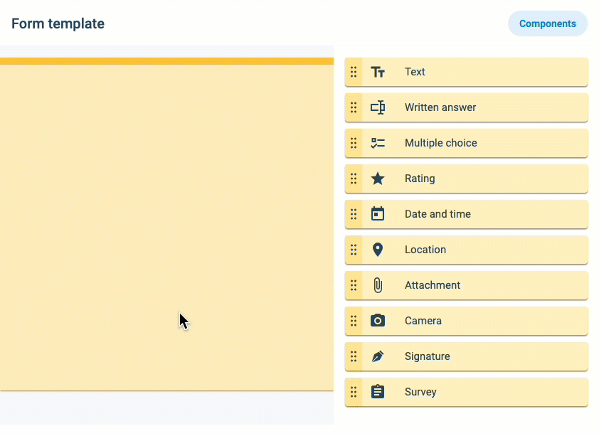
Below is a list of available survey components.
List of available form components:- Text: Inserts text into the survey. Usually used as instructions.
- Written Answer: Users can write a reply to the question. This component can also be configured to read QR Codes or NFC input on mobile devices.
- Multiple choice: Give users multiple-choice questions. This component can be configured as a dynamic survey, i.e., to display more options as certain answers are given.
- Rating: Users can rate an item with "stars".
- Date and time: Answers are received in date or date & time format.
- Location: Current or other GPS location is obtained through an embedded Google Map.
- Attachment: Send almost any type of file through the survey.
- Camera: Send pictures directly from a camera or gallery.
- Signature: Freestyle brush that permits handwriting. Useful for signatures.
- Survey: Adds an existing survey into the survey.
Configuring Form Components
General component configuration is discussed here.
Icons and each configuration tab are explained below.
Icon Descriptions:
The following icons are used in most of the form components for setup and configuration options.
| Action Name | Image | Description |
|---|---|---|
| Drag |  | Hold click to drag component |
| Required |  | Click to make the component a required field that the user must fill out. |
| Writing not permitted |  | Users cannot answer the question but will still be visible in the survey. |
| Duplicate |  | Duplicate the component. It will not duplicate the identifier. |
| Delete |  | Delete the component |
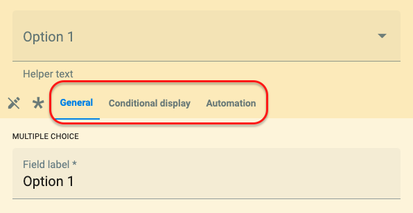
You can edit a component by clicking on it once it is on the template.
Each component has three sections (tabs) that can be configured: General, Conditional display, and Automation.
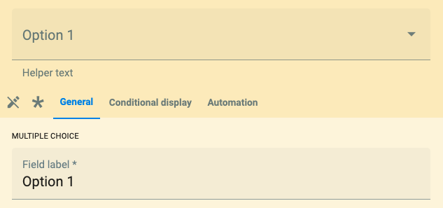
General Tab
From the General tab, configure basic component settings. Each component will display in this tab its specific basic configuration. Some components might also require creating collections and elements. Go to a component's page for specific field descriptions, configuration, and requirements.
General Field Descriptions:
It will be needed if working with APIs, dashboards, routines, conditional display, or automations.
Conditional Display Tab
Each component has the conditional display tab, which allows you to make a dynamic survey, i.e., depending on the answers given to a certain question, new questions relative to the answer will appear. For example, if the response of component X is A, component Y will be displayed; otherwise, it will remain hidden.
The conditional display settings panel:
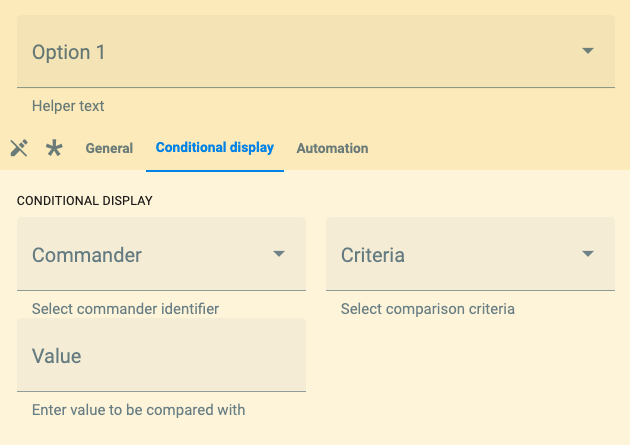
The descriptions of the fields are found below:
Select the commander identifier, i.e., the identifier of the component that will determine if the conditionally displayed component opens up.
All existing component identifiers of the present survey are displayed.
Options are: Is equal to, Greater than or equal, Less than or equal or Regular expression.
Write the identifier related to the commanding answer.
For multiple answers, use the following syntax: (example1)|(example2)
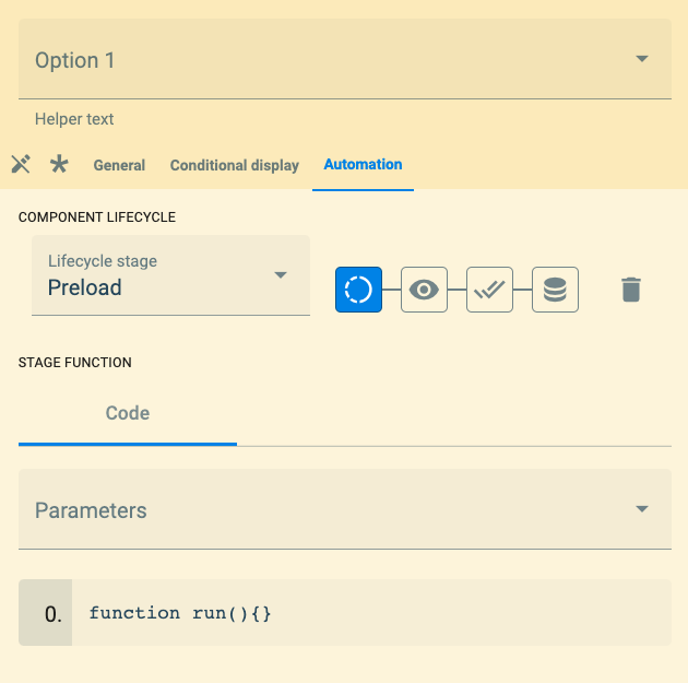
Automation Tab
From the automation tab, you can add Javascript code to customize your surveys even more. For complete information and examples, go to the QuestionExec section.