Create/Edit a Workflow Group
Esta página aún no se encuentra traducida al español.
Basic workflow group settings
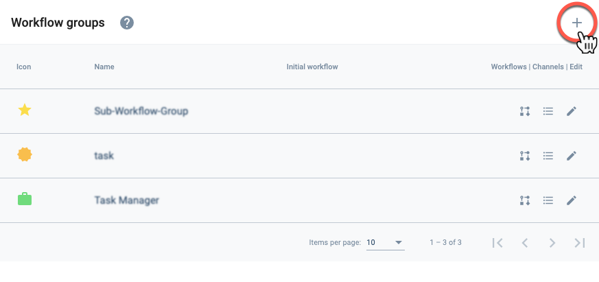
Create a Workflow Group
From the Initial Settings Panel (Workflow Groups), press +.
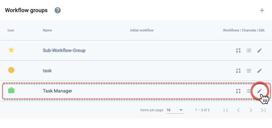
Edit a Workflow Group
From the Initial Settings Panel (Workflow Groups), press the corresponding icon from the workflow group list.
Settings Panel Layout
After choosing to create or edit a workflow group, the following settings panel opens up:
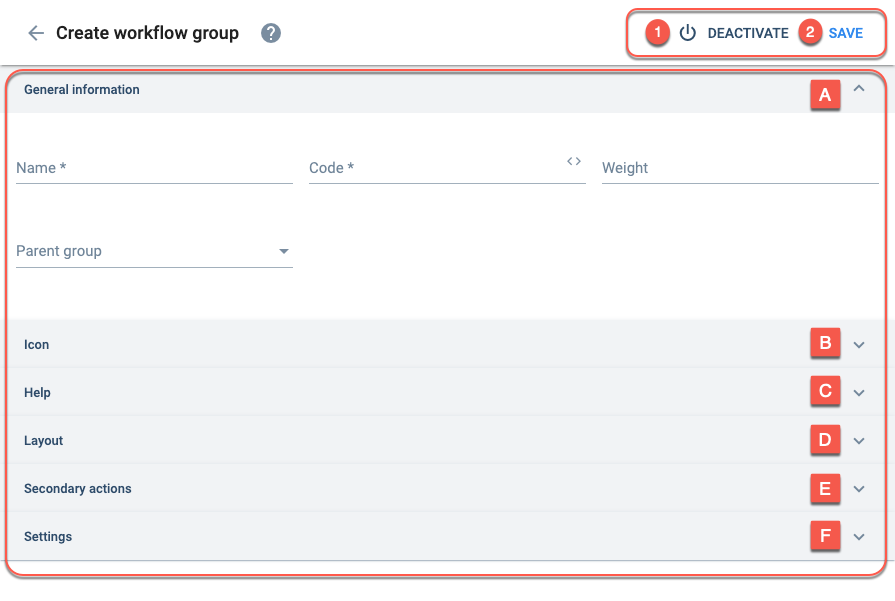
Options:
- Deactivate: Deactivate the element.
- Save: Save current configuration.
Settings:
Basic setup and display options.
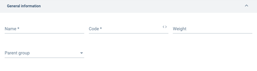
Name:
The group's display name.
It doesn't have to be unique.
Code:
Group identification name. Must be unique. Only lowercase letters, numbers, and underscores are accepted. The first character must be a letter.
The code cannot be edited once it is saved.
Weight:
A relative number that positions the group on the list. Smaller numbers accommodate the group near the top, larger numbers towards the end.
If you don't type a number, the system will assign one.
Parent Group:
The group can be positioned within another group as a child. The parent group must already exist.
B. Icon Fields
Configures the group icon shown on the Main Menu Bar or Group Panel.
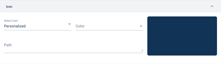
Select icon:
Choose personalized or pre-designed icon from the menu.
Personalized icons are configured in the "Path" field.
Color:
Choose from the menu the icon's color.
Path:
Must be filled with Scalable Vector Graphics (SVG) code.
The path is completed automatically when a pre-designed icon is chosen. For personalized icons, SVG code must be inserted manually.
C. Help Fields
Sets up onboarding when users log in to the app or website.
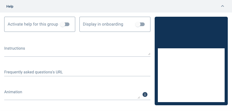
Activate help for this group:
This function is for mobile apps only.
Currently unavailable.
Display in onboarding:
Will display onboarding instructions when users log into the app or website.
Instructions:
Text that will be displayed.
Instructions will be displayed below the animation.
Frequently asked questions' URL
This function is for mobile apps.
Currently unavailable.
Animation:
Animated image shown in group onboarding. JSON animation format only.
D. Layout Fields
Configures how channels are displayed in a workflow group.
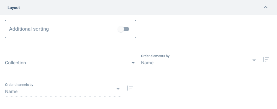
Additional sorting:
Permits you to configure the order in which workflow group channels are displayed.
The default option is to sort channels by name, and then by the last message sent.
Collection:
Channels will be sorted by the elements (properties) contained within the selected collection (property type).
If the channels are not related to the selected property type, they will not be sorted.
Order elements by:
Elements will be sorted by the selected option.
Available options are: Created At, Weight, Modified At, and Name
Order channels by:
Channels will be sorted by the selected option.
Available options are: Created At, Last Message, Modified, At and Name
E. Secondary Actions
This section allows you to set up the secondary actions which are made available for end-users through a group's actions button. With secondary actions users can access URLs, which can be configured to go to different channels or even open external websites.
Learn more about the workflow group actions button.
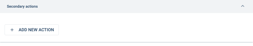
+ ADD NEW ACTION: creates an action that can be accessed through the actions button.
Pressing this button opens up a New action pad. Press the pad to open the new action's settings panel.
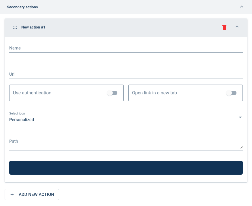
Name:
Name given to the action. The name will appear as an option in the Actions Menu.
You can use any characters.
Url:
Indicates de URL that will be accessed. URLs can point to external or internal pages. They can also point to sections within the app, surveys, and tasks by indicating their URL.
You can obtain the URLs for surveys, tasks, and other app objects by going directly to them and copying the address directly from your navigator's URL bar.
Use authentication:
Sends the user's authentication token to external sites.
This is needed for external sites that require Cotalker authentication. For security reasons, use only on trusted sites.
Open link in a new tab:
If activated, the URL will be opened in a new tab in your browser. Otherwise, it will open inside the Cotalker app window.
Select icon:
You can choose between personalized or pre-designed icons.
The color cannot be changed.
Path:
Must be filled with Scalable Vector Graphics (SVG) code.
If the icon was selected from the list of pre-designed icons, the path will be completed automatically. If a personalized SVG is desired, its code must be inserted manually.
F. Settings
Set display settings.
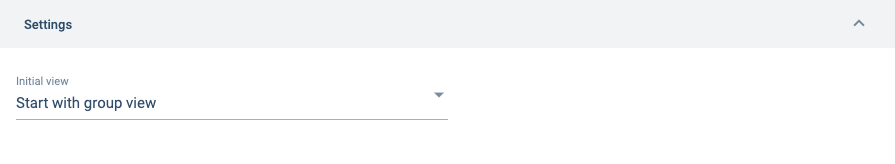
Initial view:
Set whether a workflow group opens initially from a task view or group view.
Task view is the default value.
Options are:
Start with group view: opens the workflow group's group panel.
Start with task view: opens the workflow group in task view.
Click here for more information on configuring the initial workflow group display.
Best Practices
Sorting Tasks
It is recommended to sort tasks in the group panel by states so that users can visually identify the state their tasks are found in. Task (workflow) states are represented by the elements (properties) found in the collection (property types) associated with the workflow.
Sorting tasks by states can be set in the layout section of the settings panel by choosing the collection where the workflow states are found in.