Groups Section

Overview
Standard Groups_, simply referred to as "groups", are to be differentiated from workflow (task) groups and link groups. As the other group types, standard groups can be accessed through the Main Menu Bar or in the Group Panel as sub-groups of other groups. Standard groups are mainly used for communication purposes. Users can be added as participants in the group, allowing them to use the group panel's actions button, access sub-groups, open link groups, access the group's channels, and other resources that can be added to a group and its channels.
Through Channel Workspaces within Standard Groups, users associated to a channel can send messages, share files, answer surveys, and view other users participating in the channel.
Accessing Groups Section
To access the Groups section:
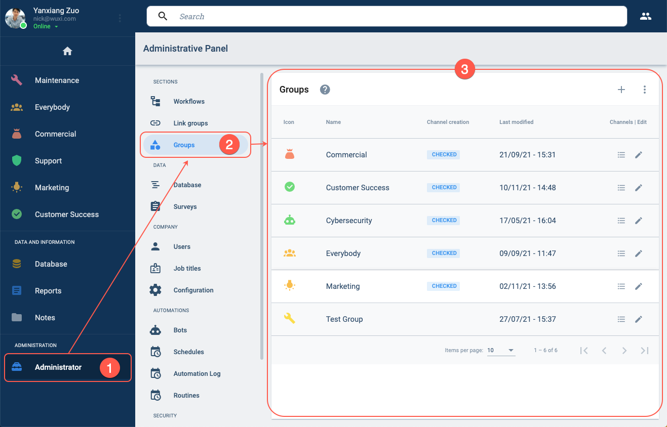
- Press the Administrator in the Main Menu Bar.
- Select Groups in the Administrative Panel.
- The Groups section opens up.
Groups Section Layout
The Groups section consists of a table displaying all the standard groups that exist within the company.
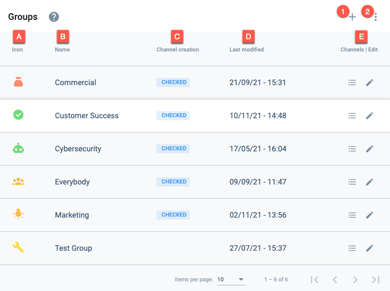
Actions:
- 1. Create group: Press the + icon to open a group settings panel to create a new group.
- 2. More actions: Shows option for displaying disabled groups.
Settings and Options:
- A. Icon: Displays the icon that represents the group in the Main Menu Bar or Group Panel.
- B. Name: Indicates the group's display name.
- C. Channel creation: Indicates if channels can be created in the group.
- D. Last modified: Indicates the last time the group was edited.
- E. Channels | Edit: The respective icons permit either viewing all the channels within the group or editing the group.
Create a Group
From the Groups Section, press the + icon to create a new group. The group settings panel opens up to configure and save the new group.
Edit a Group
From the Groups Section, press the corresponding pen icon to edit a group. The group settings panel opens up to configure and save the new group.
Group Settings Panel Layout
The following settings panel opens up when creating or editing a group.
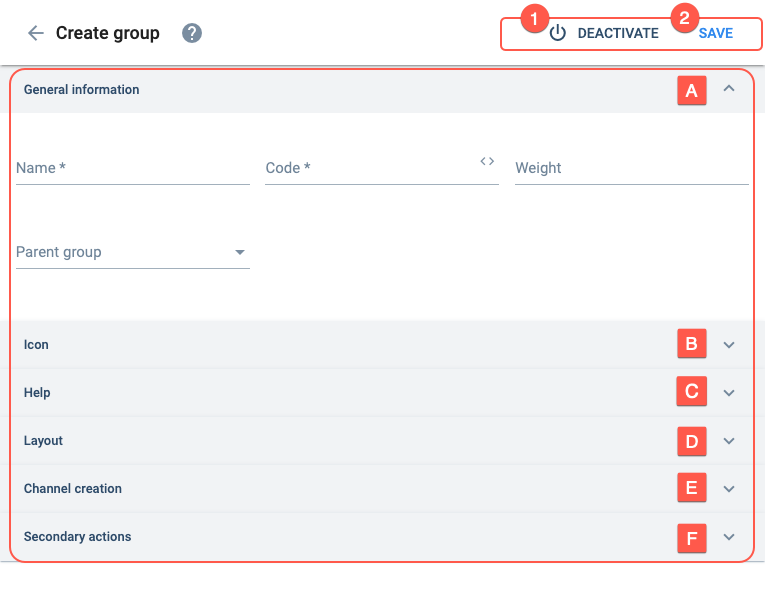
Actions:
- 1. Deactivate: Disables (or enables) the group's availability.
- 2. Save: Saves current changes made to the group.
Settings:
- A. General information: Basic group settings.
- B. Icon: Configures the group icon shown on the Main Menu Bar or Group Panel.
- C. Help: Sets up onboarding.
- D. Layout: Configures how channels are displayed in the group.
- E. Channel creation: Allows users to create new channels within the group.
- F. Secondary actions: Configures the actions button in the group panel.
A. General information
Basic group settings.
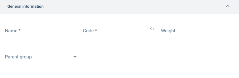
View an example of a parent–child groups.
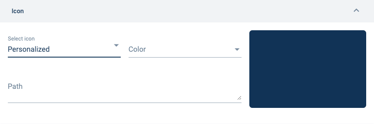
B. Icon
Configures the group icon shown on the Main Menu Bar or Group Panel.
C. Help
Sets up onboarding when users log in to the app or website.
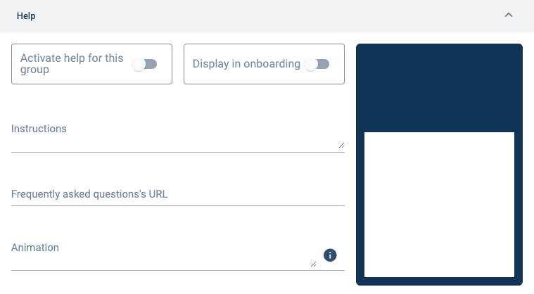
We recommend using Lottie File.
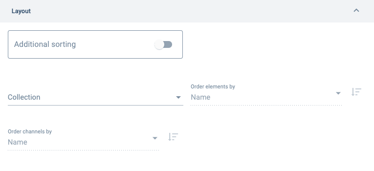
D. Layout
Configures how channels are displayed in the group.
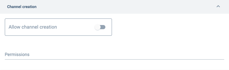
E. Channel creation
Allows users to create new channels within the group. The new channels are created using the actions button on the group panel.
F. Secondary actions
Configures the actions button in the group panel. See below to learn more about actions button setup.
About the Actions Button
Overview
In standard groups, through the actions button –a green floating button that appears at the bottom of the group panel– users can create new channels and choose from a list of links to external or internal URLs.
The actions button and its corresponding actions menu will look something like the image below:
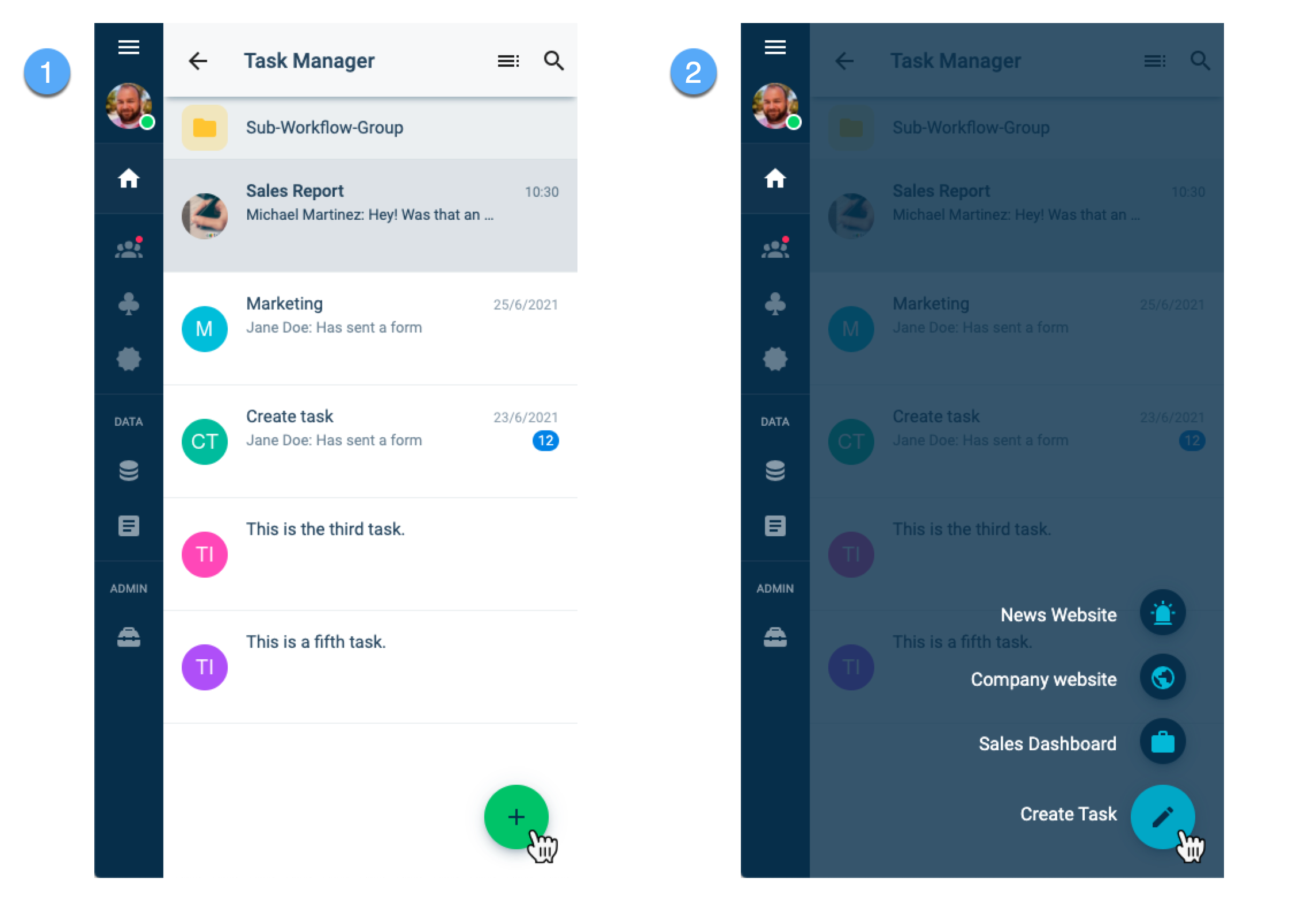
"Actions" in the actions button menu are usually used as links to important tools or information, either within the Cotalker platform or on the web.
Only in standard groups can users create new channels.
Create Channels
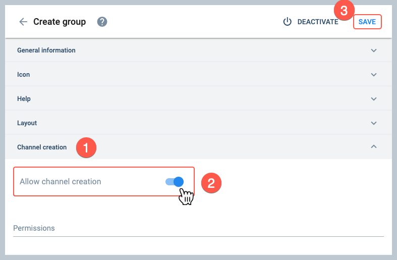
To allow users to create new channels through the actions button, do the following:
- Go to the Channel Creation section.
- Turn on the Allow channel creation option.
- Save when done configuring the group.
Create URL links
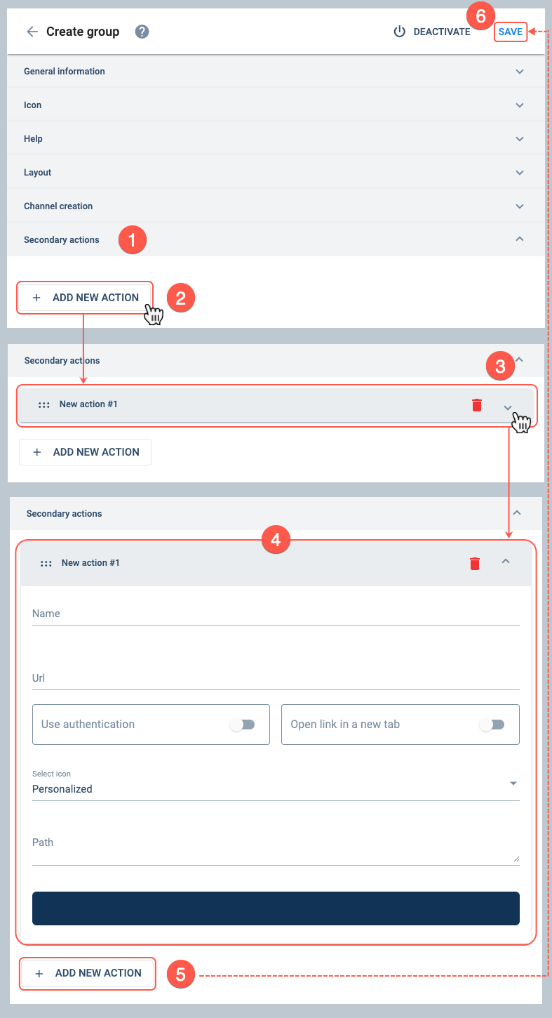
To add links to the actions button menu, do the following:
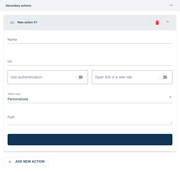
- Go to the secondary actions section.
- Press the + Add New Action button to open up more settings:_
- A field component representing the new action appears. Press on the component to open up the settings panel.
- Configure the action's settings.
- If more actions need to be added, press the + Add New Action button again and complete the configuration
- Save when done configuring the group.
- Go to the secondary fields section for more information on settings.
- The action components can be dragged and dropped to sort them in the order you wish them to appear on the actions button menu.
Access the Channels Panel
To access the channels within a group:
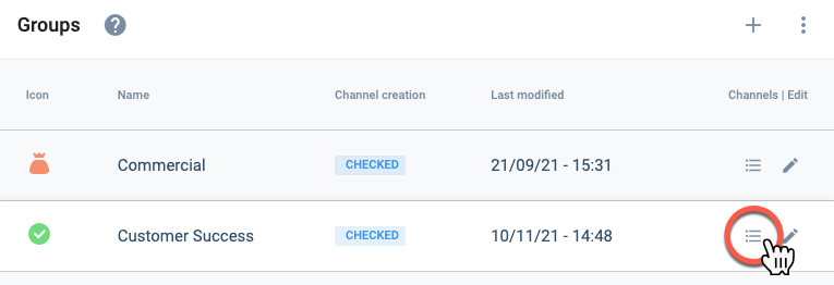
- Go to the Groups section.
- Select the list icon of the group containing the channels you wish to view.
- The Channels Panel will open up displaying a table with all the channels within the group.
Channels Panel Layout
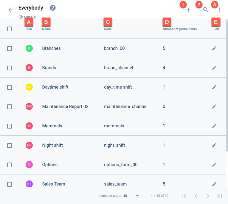
The Channels Panel is a table that displays all existing channels within a group.
Actions:
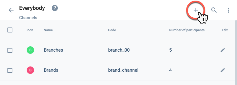
- 1. Create channel: Opens the channel settings panel to create a new channel.
- 2. Search: Search for channels within the group.
- 3. More options: Allows viewing disabled channels.
Settings and Options:
- A. Icon: Displays the avatar that represents the channel.
- B. Name: The channel's display name.
- C. Code: The channel's unique identification code.
- D. Number of participants: Amount of users associated to the channel.
- E. Edit: Opens the channel settings panel to edit the corresponding channel.
Create Channel within a Group
From within the Channels Panel, you can create a new channel by pressing the + icon. This will open up the Channel Settings Panel, where you can configure and save a new channel.
Edit a Channel within a Group
From within the Channels Panel, you can edit an existing channel by pressing the pen icon. This will open up the Channel Settings Panel, where you can configure and save a new channel.
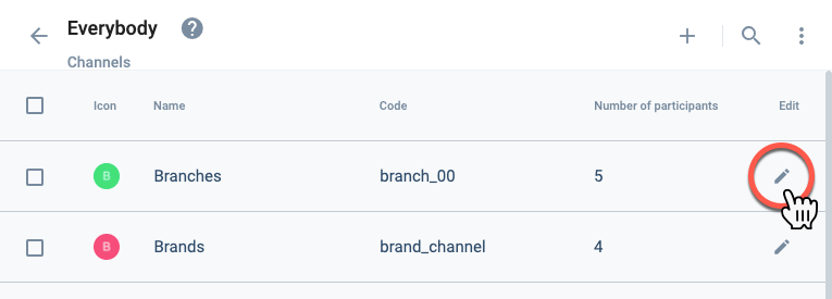
Channel Settings Panel Layout
Whether creating or editing a channel, the following settings panel will appear.
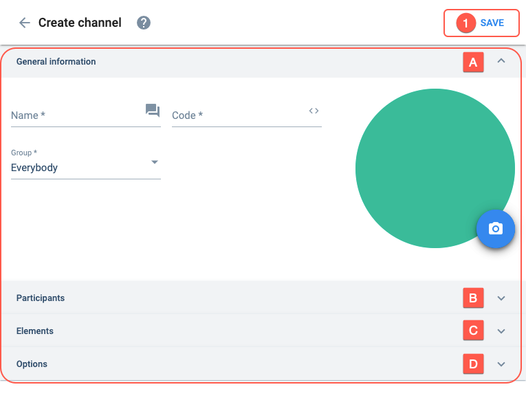
Actions:
- 1. Save: Saves current channel configuration.
Settings:
- A. General information: Basic channel setup information.
- B. Participants: Sets the users that can participate in the channel.
- C. Elements: Indicates elements associated with the channel.
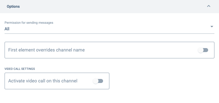
- D. Options: Configures special channel options.
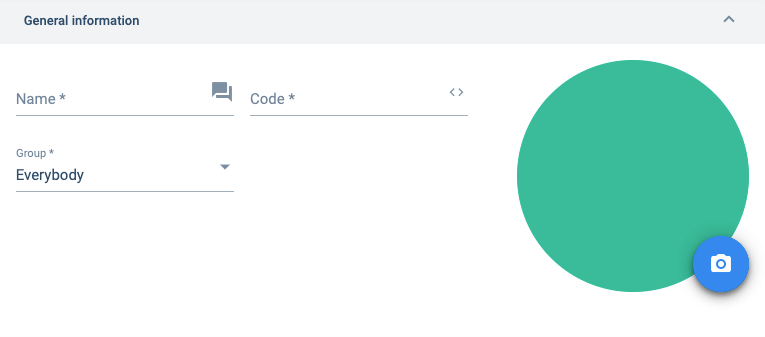
A. General information
Basic channel setup information.
B. Participants
Sets the users that can participate in the channel.
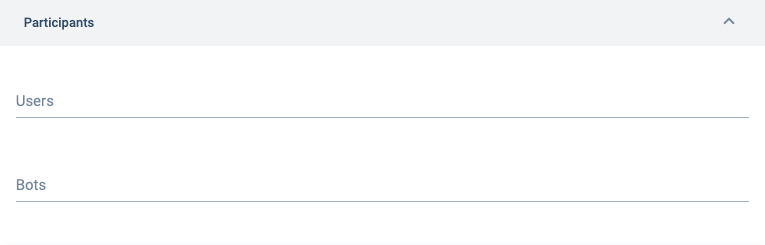
See this tutorial on how to make a bot that works within the channel.
C. Elements
Lets you add an element to your channel. Useful when setting up a routine or survey associated with a particular _element. For example, if you add elements associated with a survey to the channel, the survey will be available through the actions button found in the channel's workspace._
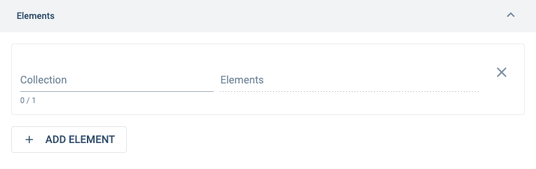
Indicates which collections (property types) are associated with the channel. Used for classifying channels or making surveys available, among others.
Indicates the collection's elements (properties) which have been chosen for the channel. Used for classifying channels or making surveys available, among others.
D. Options
Configures special channel options.