Categories

Overview
In the Categories section, you can set up groups that act as sub-menus within the Main Menu Bar. Category groups are sets of standard, link, and/or workflow groups categorized together.
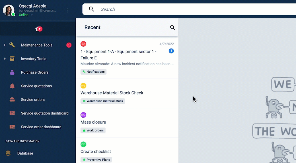
Category groups appear on the Main Menu Bar as shown below:
- Category groups can only be one level deep.
- Groups nested within a parent group, i.e., groups not displayed in the Main Menu Bar but within a group panel, cannot be placed into categories.
- Sub-menus appear initially in the closed position but will always reappear in the last position in which the user left them.
Access the Categories Section
To access the Categories section:
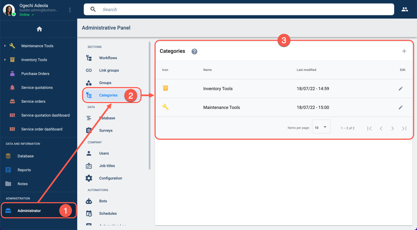
- From the Main Menu Bar, select Administrador.
- In the Administrative Panel, choose Categories.
- The Categories section opens up. From there, you can create or edit category groups to set up sub-menus.
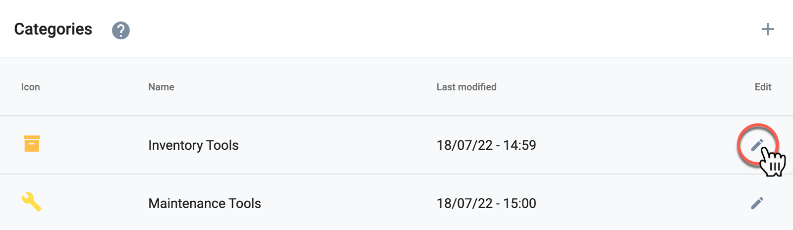
Categories Panel Layout
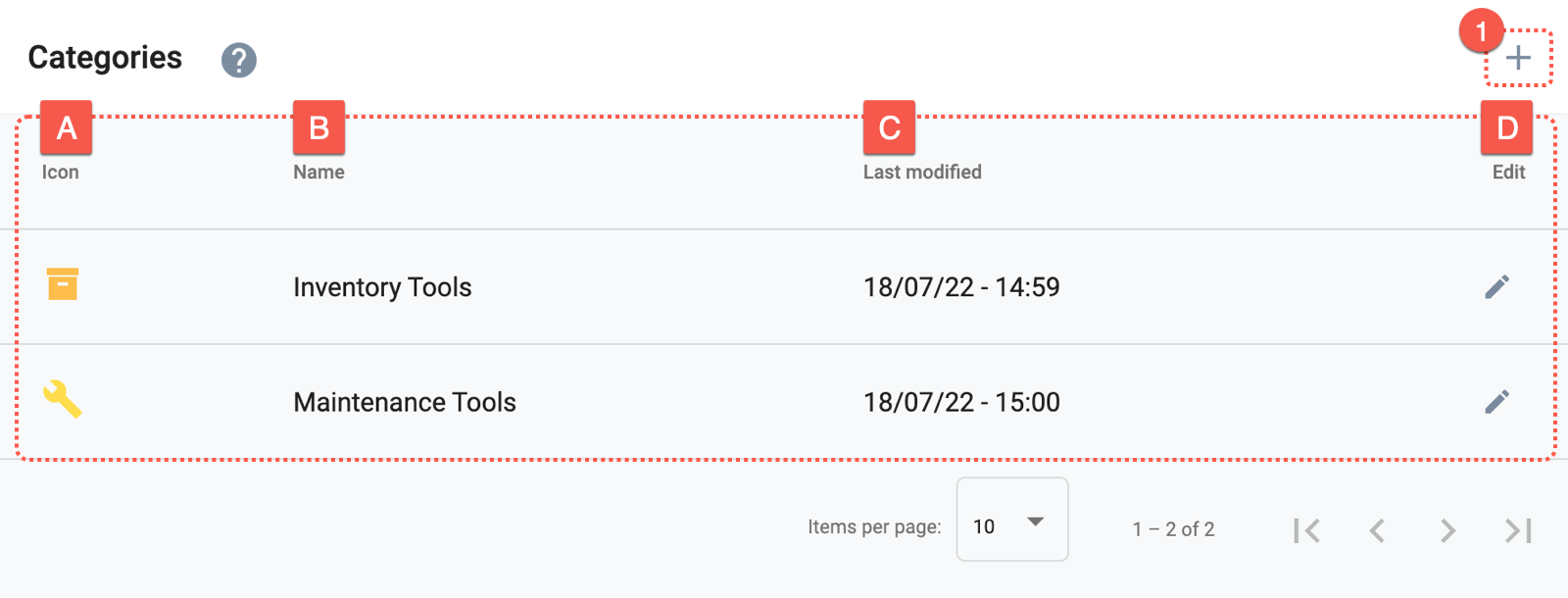
The Categories panel contains a list of all existing category groups, along with the options to create and edit them.
Actions:
- 1. Create new group: Create a category group that will be displayed as a sub-menu in the Main Menu Bar.
Options:
- A. Icon: Displays the category's icon.
- B. Name: The category's name.
- C. Last modified: Indicates when the category was last modified.
- D. Edit: The pen icon lets you edit the group.
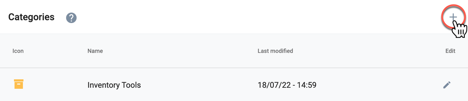
Create a New Group
To create a new category, press the + icon found in the upper right-hand corner. Afterward, the Create Category settings panel will open up.
Edit a Group
To edit an existing category, press its corresponding pen icon. Afterward, the Edit Category settings panel will open up.
Create/Edit Group Settings Panel Layout
Whether creating or editing a category, the following settings panel opens up:
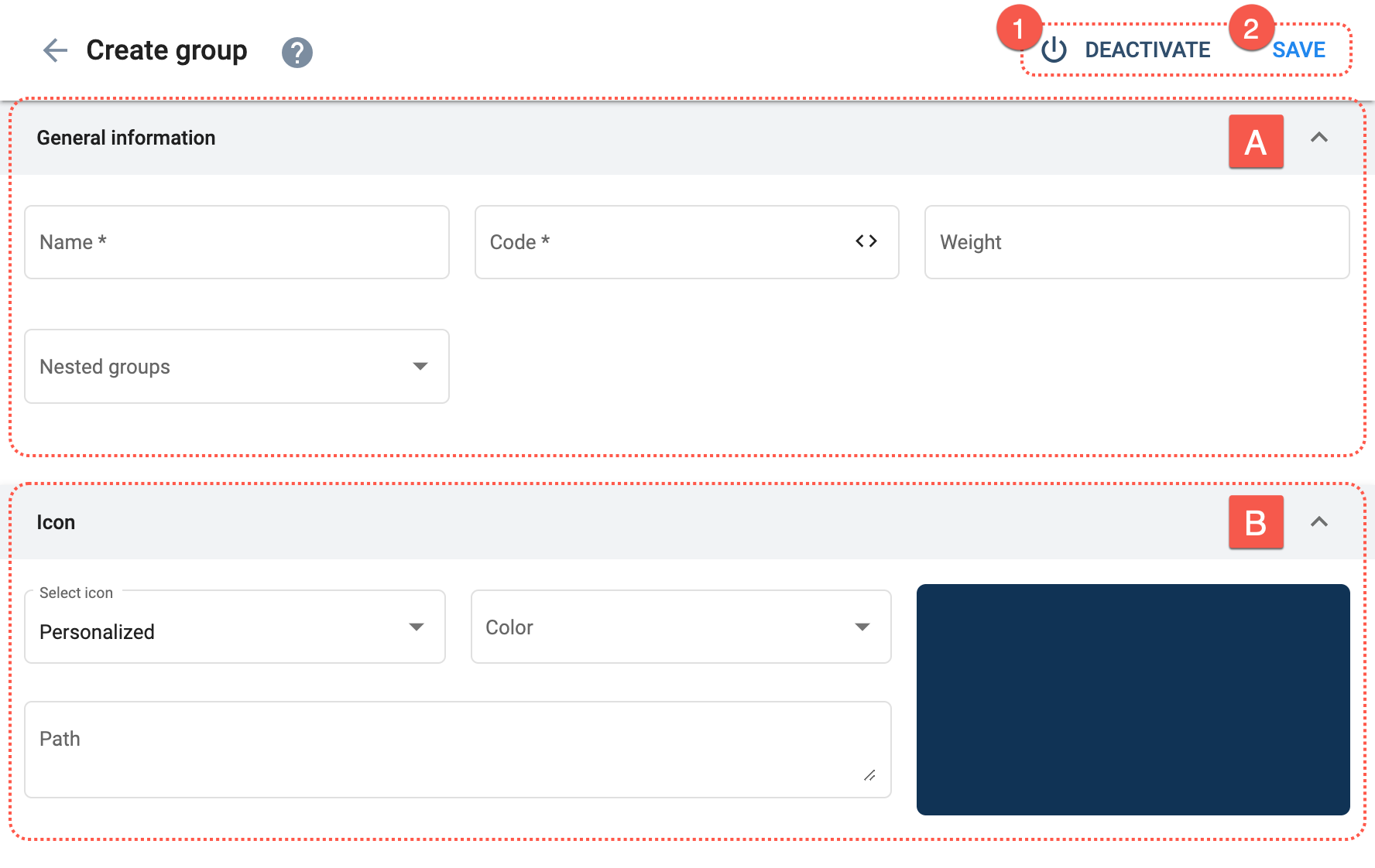
Actions:
- 1. Deactivate: Makes the category group unavailable.
- 2. Save: Saves the last changes made to the category group.
Options:
- A. General Information: Indicate the category group's basic settings.
- B. Icon: Set the icon representing the category group on the Main Menu Bar.
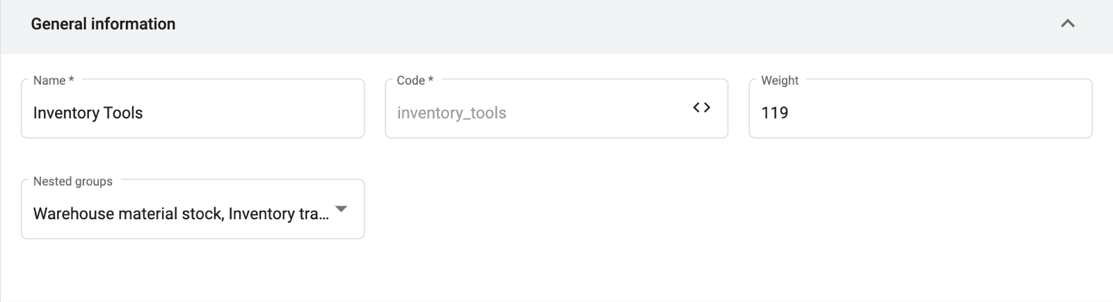
A. General Information
Set up the category group's basic settings.
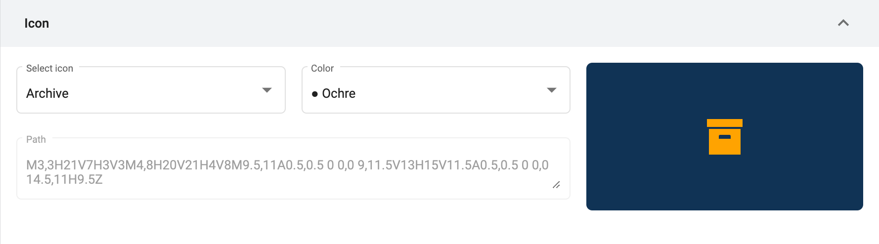
B. Icon
Configure the category's icon displayed on the Main Menu Bar.
Related Resources
- COTGroup Data Model: The
isCategoryandnestedGroupsfields are used in conjunction to establish a group as a category. - Group API Reference: The
hasCatergoriesparameter filters category groups.